Bringing order, clarity and meaning to a complex brand
- Branding
- Web experience
- Digital strategy
- Corporate website
- Brand diagnosis and strategy
- Brand identity
- Activation and scalability
RDT is an engineering company with a solid track record, strong international growth, and a broad portfolio of services. However, its brand and digital ecosystem did not reflect either its true size or its ambition for the future. The complexity of the group, the lack of visual consistency, and a poorly structured website made it difficult to understand its value proposition and limited its ability to compete with the major players in the sector.
The challenge was to transform a technical and scattered brand into a clear, coherent, and recognizable brand, capable of organizing its complexity and projecting a global ambition.
Bringing order, clarity and meaning to a complex brand
RDT had grown organically for years, incorporating subsidiaries, services, and markets. This growth, although successful at the business level, had resulted in a fragmented brand, with multiple visual codes, scattered messages, and an architecture that was difficult to understand both internally and externally.
The challenge was clear: regain control of the brand, give it a solid and coherent structure and build an identity capable of accompanying its future growth without losing closeness or internal culture
From technical engineering to a brand with purpose
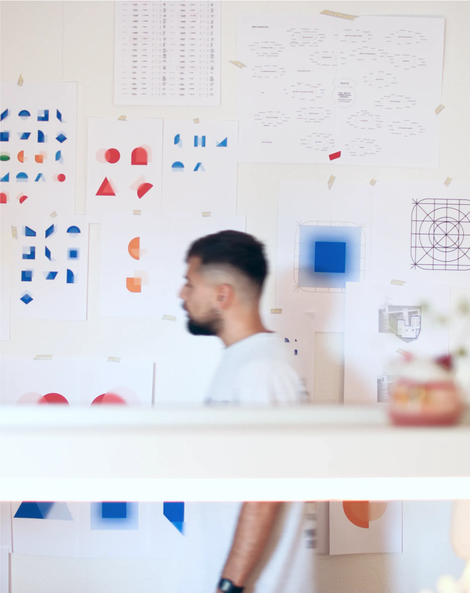
The project began with a collaborative strategic and visual analysis and diagnosis phase, in which we actively involved RDT management and key people from different areas and countries within the group. This work was complemented by an external perspective that allowed us to contrast internal perceptions with the reality of the market and the competitive environment.
Through this shared process, we audited the RDT brand, its ecosystem, its portfolio of subsidiaries, and its positioning, identifying inconsistencies, opportunities for differentiation, and strategic levers to evolve the brand with discernment and ambition.
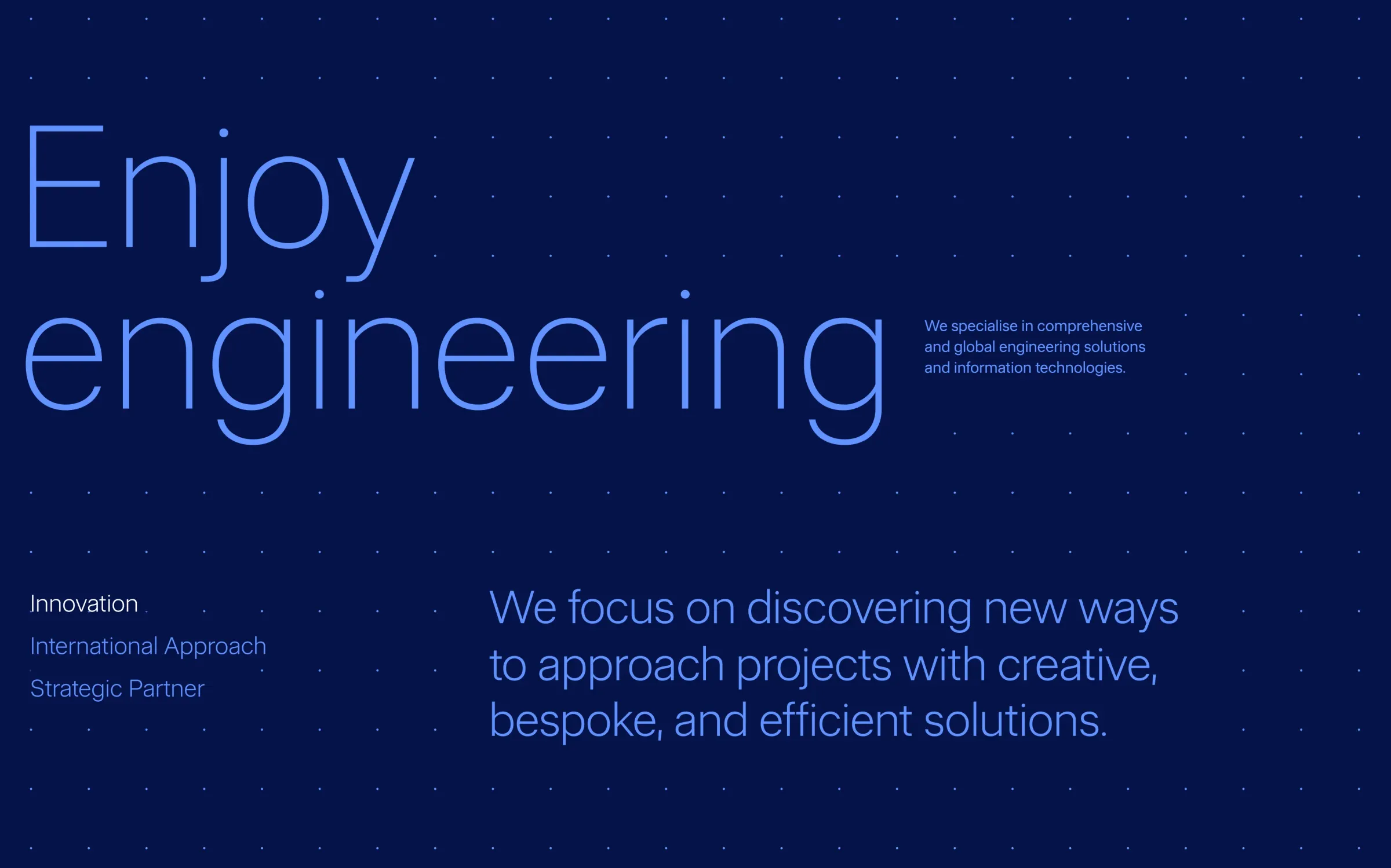
Based on these conclusions, we defined a new brand platform that articulates mission, vision, values, purpose, personality, and tone of voice. A solid strategic foundation aligned with management, which positions RDT as a trusted, innovative, and approachable technology partner, and introduces a key idea: putting people at the center of engineering.
Defining a clear and shared architecture made it possible to transform a fragmented portfolio into a brand system aligned with the business strategy, backed by management and ready to scale and integrate new units in a coherent manner.
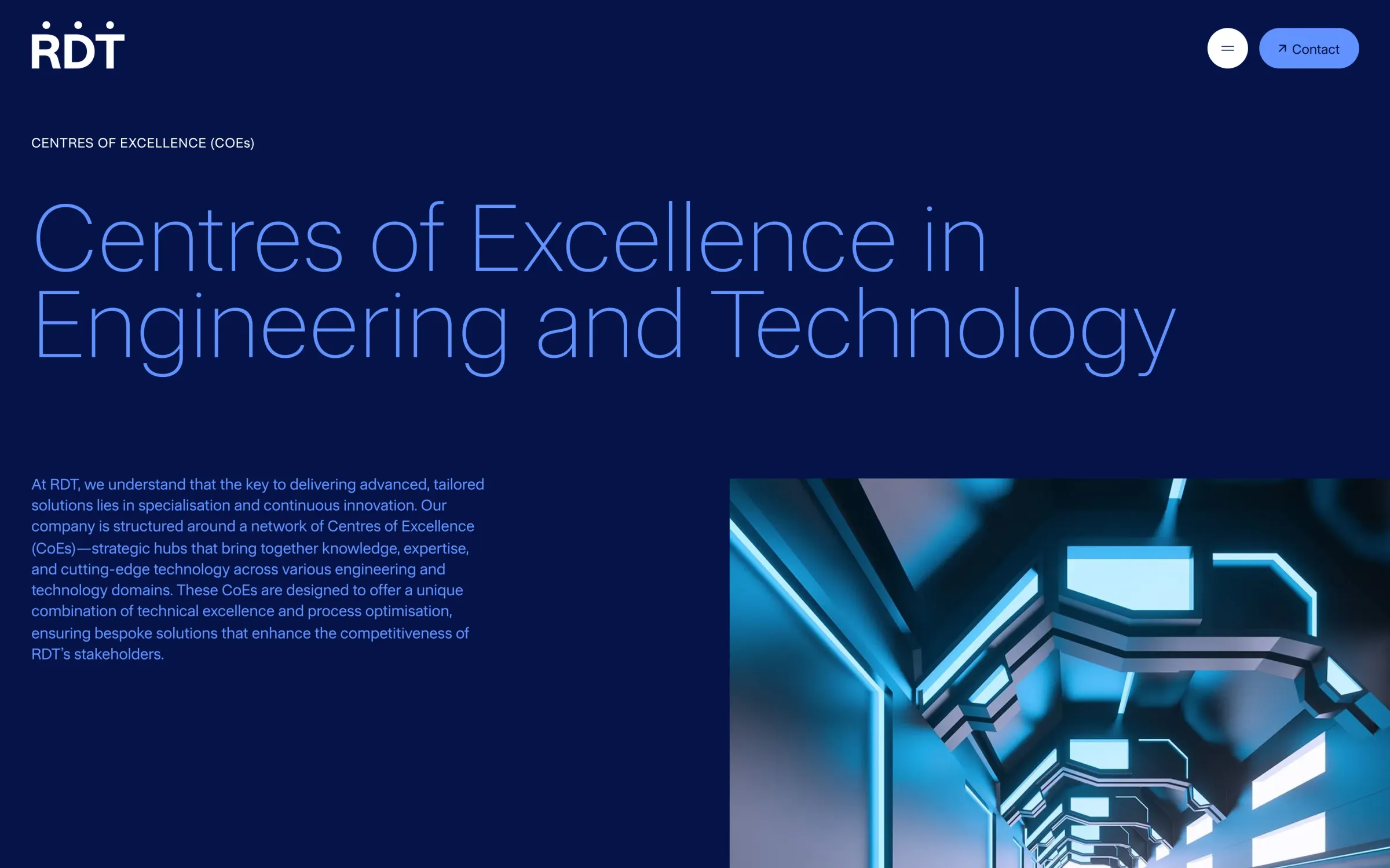
A brand architecture that organizes and empowers
One of the pillars of the project was the definition of a new brand architecture, approached from a strategic and governance perspective, in close collaboration with management and the heads of different units within the group. The objective was not only to organize the portfolio, but also to build a shared model that was understandable and sustainable over time.
This work made it possible to analyze the real role of each unit, its autonomy needs, and its contribution to the group as a whole, incorporating both the corporate vision and the operational reality of the subsidiaries.
The result was the definition of a Hybrid Brand Architecture, combining a strong Branded House as the backbone of the system with an Endorsed Brand for those units that required greater independence. This approach allows the ecosystem to be organized, the role of each brand to be clarified, and a coherent, scalable system to be built that is aligned with the business strategy and ready to grow without losing focus or consistency.
A brand identity that organizes the complexity of RDT, reinforces its recognition, and prepares it to grow in a consistent and solid manner across all its touchpoints.
A more human, solid, and contemporary visual identity
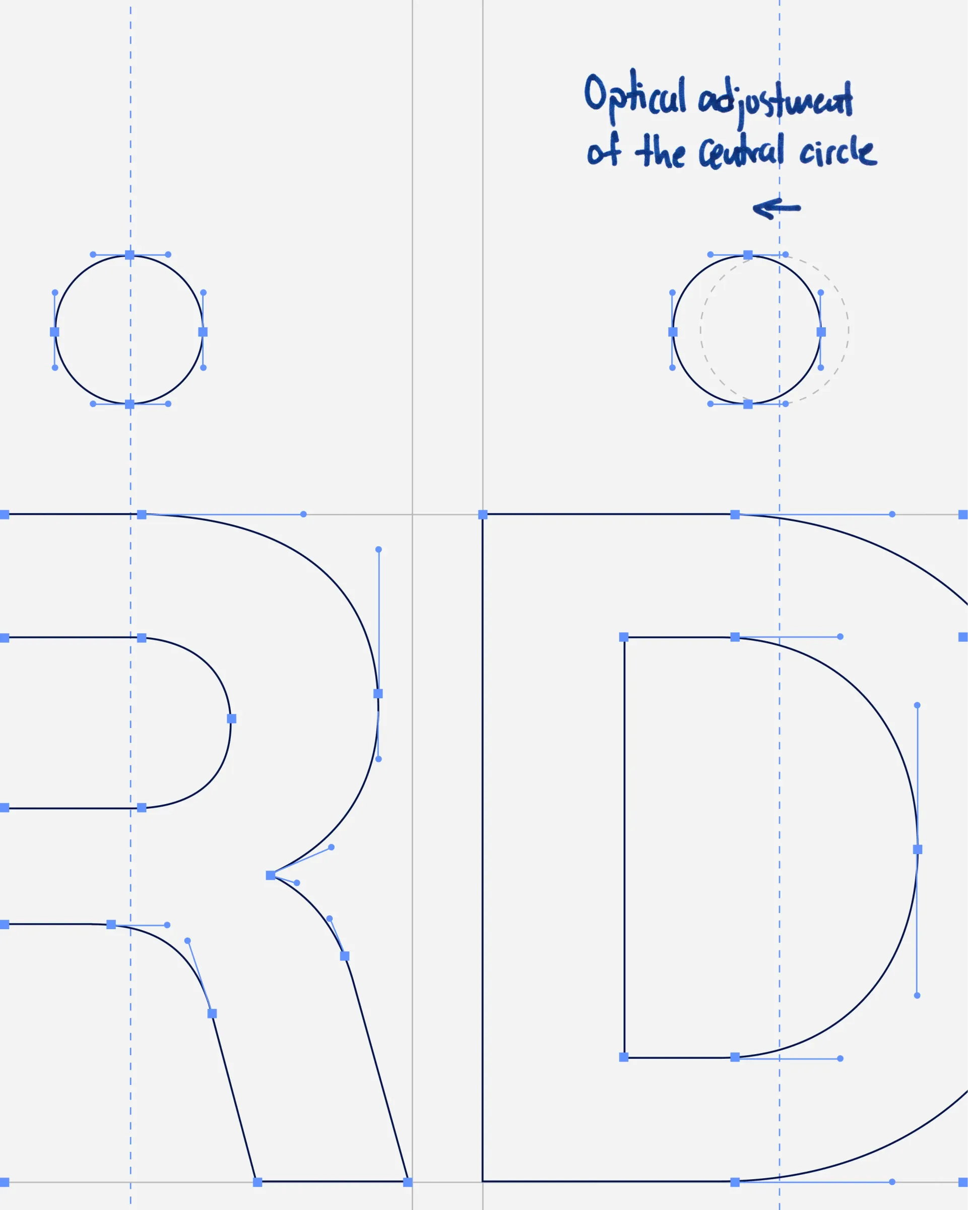
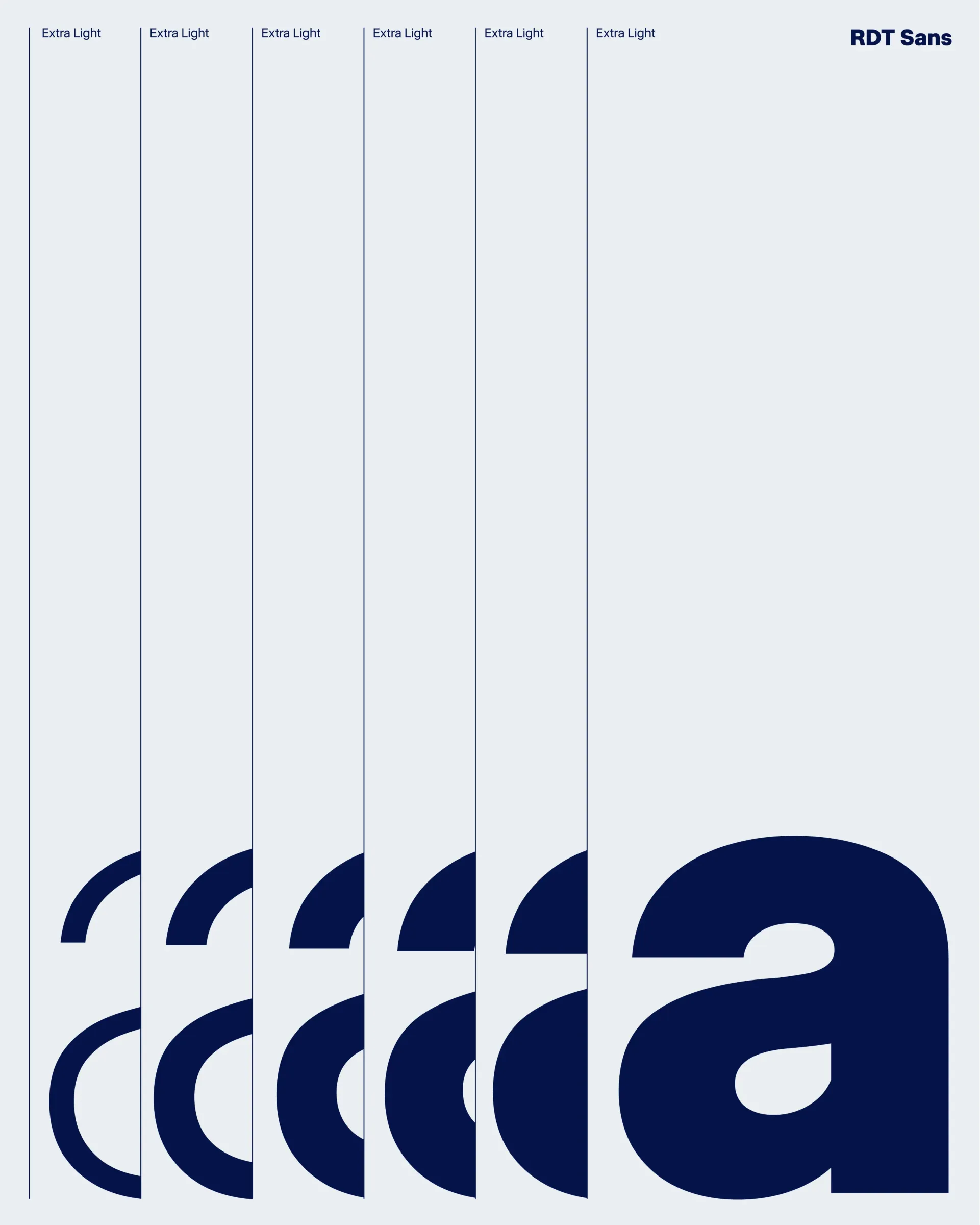
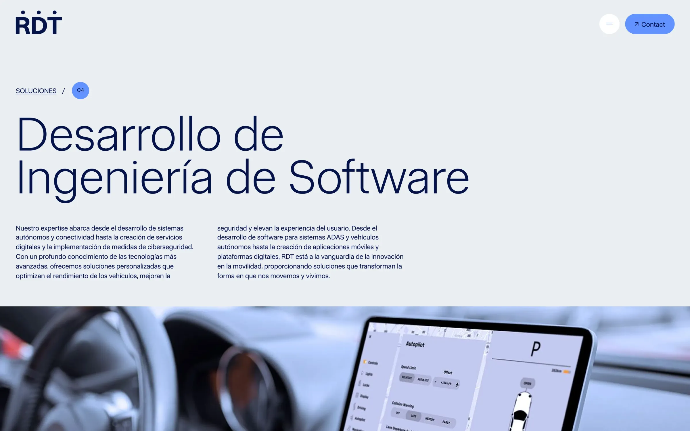
Based on the new brand strategy, we developed a brand identity capable of organizing the complexity of the group and elevating RDT's perception compared to its competitors. The redesign starts with an update of the logo and the creation of a proprietary typeface, RDT Sans, which brings personality, legibility, and consistency to all environments.
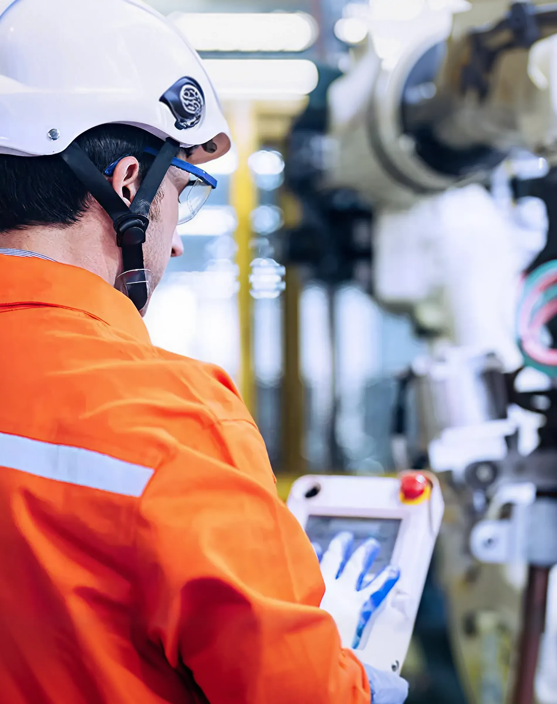
The new color system reinforces brand recognition and strength, providing greater presence and differentiation in a highly codified sector. The graphic system ensures consistency and scalability across all applications. The photographic style evolves towards a more human and approachable look, showing real professionals in authentic work contexts, with the aim of conveying professionalism, approachability, and trust.
A jointly developed digital strategy, where brand, experience and positioning work in alignment to drive business growth and RDT's international reach.
When digital strategy drives brand and business
With the new identity as a foundation, the digital project was approached from a strategic and collaborative perspective, understanding the website as a key element in aligning brand, business, and future growth.
In this context, we worked with LIN3S to define the experience strategy, which allowed us to organize and structure RDT's digital ecosystem from a user- and business-centric perspective. This work laid the foundations for the content architecture, clarifying the relationship between solutions, services, Centers of Excellence, and collaboration models, and facilitating a coherent and scalable reading of the group.
At the same time, the web architecture was based on an organic positioning strategy from the outset of the project. The definition of the main navigation trees, the prioritization of key content, and the construction of strategic landing pages were carried out taking into account both user needs and the objectives of visibility and business acquisition.
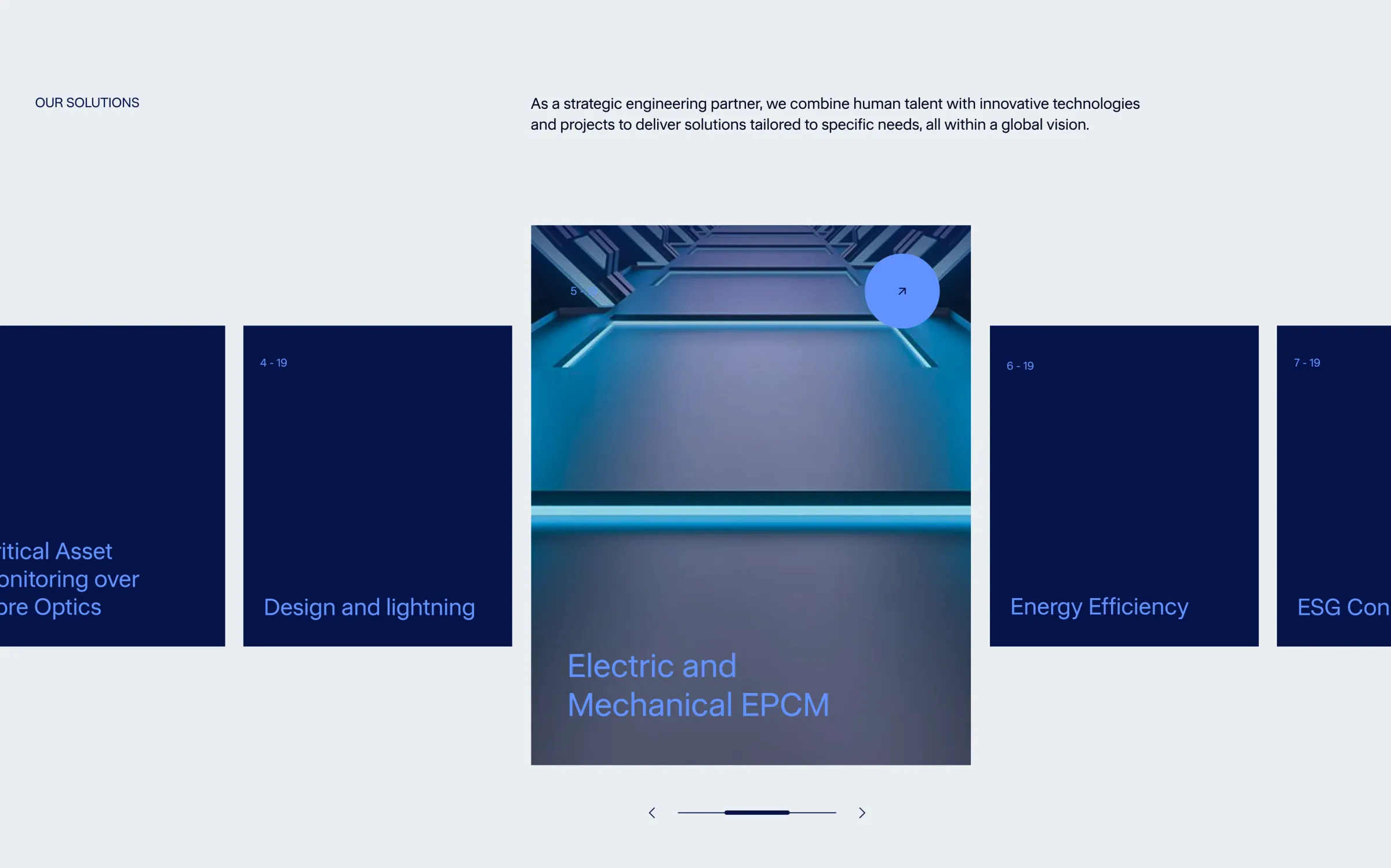
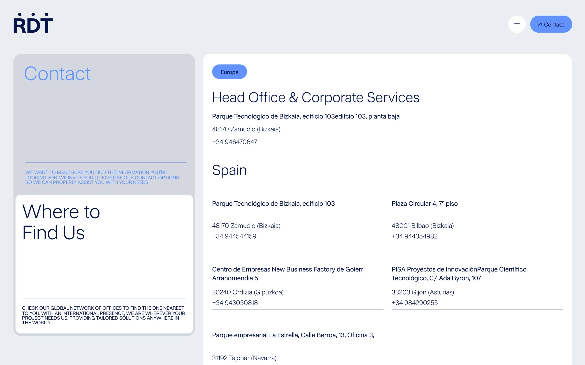
Based on this framework, we developed the design and experience of RDT's new corporate website, translating the brand strategy into a clear, structured digital environment aligned with its international ambition. The result is a website that organizes the complexity of the group, reinforces RDT's positioning as a global and human engineering company, and becomes a solid and scalable tool for connecting with customers, talent, and the market.
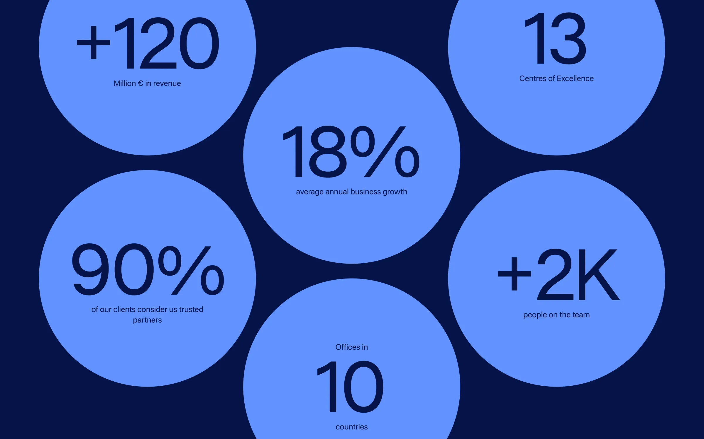
STATS
The growth in domain authority reflects a stronger positioning of the RDT website and greater relevance in search engines.
The increase in organic traffic demonstrates greater visibility for RDT and growing interest from users who are actively seeking its solutions.
Credits
- Itziar Idarraga (Lin3s)
- Davide Mariani (Lin3s)
- Leire Luengo
- Danilo Triana
- Danilo Triana
- Naiara Bordería
- Jon Ledesma
- Nerea Gomez
- Enara Etxaniz
- Jon Ander Bautista
- Manex Zabala
- RDT