Boosting institutional communication through naming and visual identity
- Branding
- Brand strategy
- Creative direction
- Digital strategy
- Visual identity
- Naming
BiscayTIK, a foundation promoted by the Provincial Council of Biscay, whose aim is to modernise the local councils of the territory through the use of ICT, proposes a project aimed at providing clarity and making its wide range of tools more recognisable for the people who work in the administration. A challenge to which we are responding with the creation of a renewed global identity system, both visually and in terms of naming.
BiscayTIK offers dozens of technological services to the municipalities and inhabitants of Biscay. Such a large number of applications required rebranding work to make them easier to identify and avoid any possible confusion.
In order to move towards the future, we must embrace our past
According to the internationally renowned writer Kirmen Uribe, the calling card of Basque speakers abroad is that of ‘an ancestral country that loves the avant-garde’. It is from this premise, which combines ancient and modern references, that we responded to the challenge posed by our client.
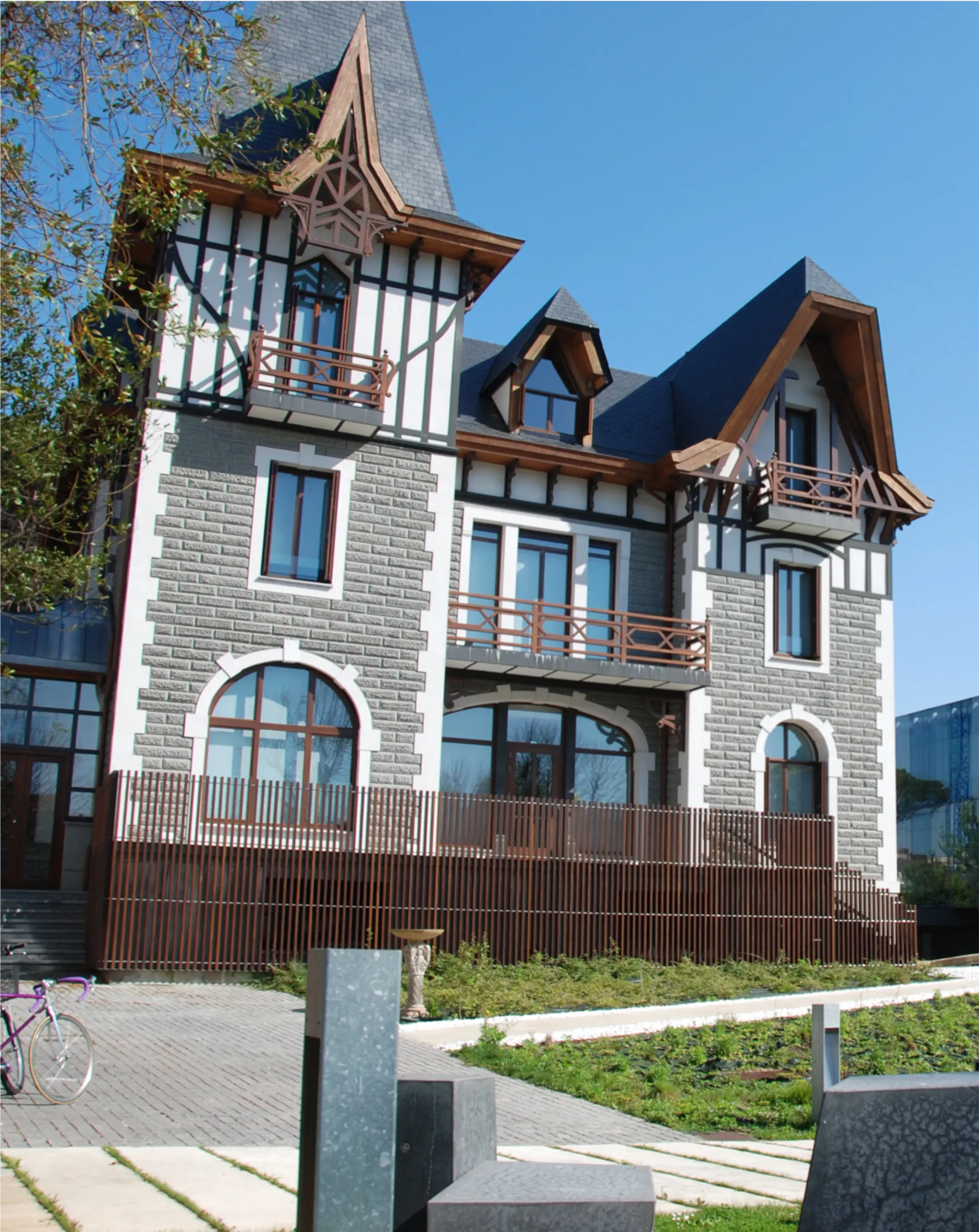
The architectural ensemble of the Foundation's headquarters located in Getxo reinforces this idea through the old building (the refurbished Bake Eder Palace) and a new one built in glass and steel; both connected by a walkway, symbol of the link between past and present. An unmistakable clue that naturally led us naturally to the branding solution proposed.
Naming the unknown and bringing it closer to the people
Interoperability, General Electronic Register, Single Definitive File or Municipal Open Data are some of the terms used by BiscayTIK in its day-to-day work. These are words with which most people are little or not at all familiar; complex and not very suggestive names, difficult to assimilate.
Likewise, as there are a large number of tools that are different from each other, the need was detected to create a connection between them, without relying on similar naming structures that could cause confusion. As a solution, we start from the idea of using different syntactic construction models such as descriptive construction or neologisms, as well as abstract, suggestive, evocative or associative terms.

Naming as a vehicle for storytelling
One of the key features of the naming proposed for the tools offered by BiscayTIK has to do with language. After all, the Foundation's aim is to facilitate the digital management of the people of Biscay and, if there is one thing that unites a society, it is undoubtedly the language it speaks. Moreover, bearing in mind that BiscayTIK also works to promote and encourage the Basque language, the name of each tool must prioritise this language.
Thus, the decision was taken to use Basque as the starting point for the naming process for the Foundation's different tools. As we detailed in the article Naming, the importance of being called, ‘naming must be a vehicle for stories, seeking to be attractive morphologically, visually and in sound, generating memorability and relevance for the public’. Thus, through a formula that starts from descriptive, etymological, patronymic and toponymic; and may involve a construction either as compound terms, contractions, or acronyms, we arrive at the final list of the 23 tools.
The use of Basque when naming tools brings them closer to the society they are aimed at and fulfils BiscayTIK's commitment to promote the language.
A perfectly variable and adaptable conceptual visual identity
The creative concept of the naming is also transferred to its visual identity, for which a fully flexible identity system is proposed, capable of reflecting the purpose of each tool. Returning to the architecture of the Foundation's headquarters, we looked at the plans of each of the buildings. From them we extract certain representative geometric elements (the arch of a window, for example), giving rise to the different compositions that make up the visual identity of each of the tools which, in a simplified and conceptual way, tell us about their function, thus reinforcing the choice of naming for each of them.
The categorisation and relationship of the tools by families is worked through the use of colour. The creative concept that unites the ancestral and the contemporary is once again transferred through the use of the material, using the uniform mass of colour, tangible and solid, to evoke the past, and a more crystalline or translucent material, which reflects the present. Thus, through the superimposition of both resources, we can glimpse the union that we can appreciate in the plan, reinforcing that connection, that union.
Credits
- Oskar Gezuraga
- Anaitz Cid
- Manex Zabala
- Peio Murgia
- BiscayTIK