We live in a digital world where design permeates everything, not as something purely aesthetic, but as a key element at the service of people who interact with digital products and ecosystems. A bad user experience can mean the loss of a visitor or a potential lead. For example, during a purchase process, reducing the percentage of abandonments can save thousands and thousands of euros (or even millions if we go to much larger businesses). The same thing happens when we talk about public management tools, such as platforms for filing income tax returns, where the consequences can be catastrophic. Ultimately, this involves public funds, and the design must facilitate the work of the administration staff as well as society. For all this, detecting the signs of frustration or points of friction is decisive if we want to ensure a good user experience that meets the intended purpose for which it has been or is being designed. But what are these signs? How can we detect and correct them? Keep reading ;)
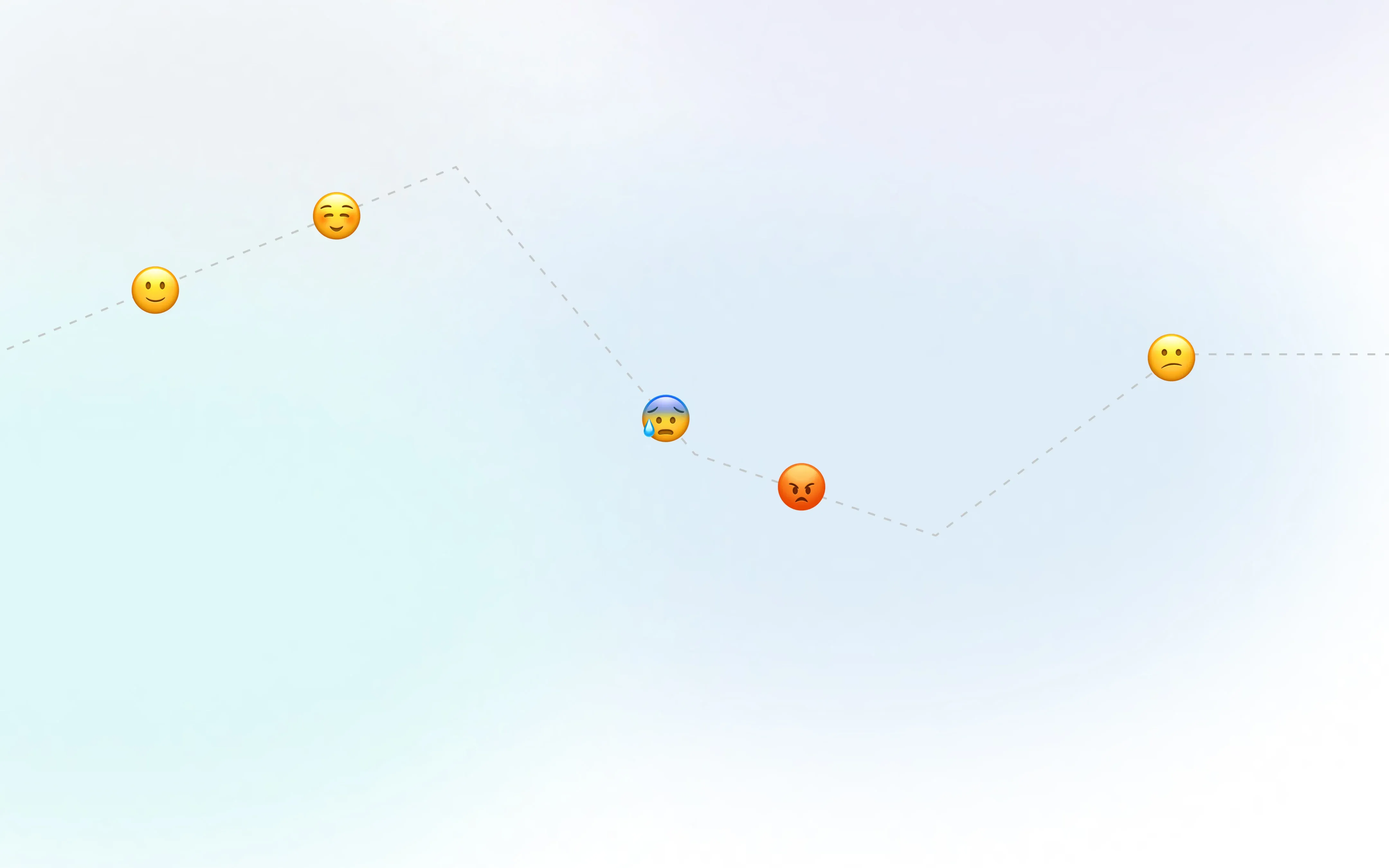
The user experience refers to the set of factors and elements related to the interaction of a person with a specific environment or device, and which gives rise to a positive or negative perception of a service, digital product or device. This perception can be evaluated through the signs of frustration; the lower the friction with a digital product is, the easier it will be for users to make decisions and easily find the information that responds to their needs and questions.
Therefore, while a visually appealing interface is key to capturing attention, the effort must go further and ensure a good user experience that holds their attention and serves the purpose of each interaction. But, how to avoid or minimize friction? Here are some tips.
Tips to avoid user frustration when designing a digital product
Although each digital product has a purpose, specific characteristics/needs or a typology of users, there are some guidelines that can help us, in general terms, to reduce friction. Although we will detail it later, at this point it is vital to carry out an in-depth user investigation. That is, knowing the public and the context in which to use the digital product (whether they are elderly or young, the device they use, etc.). These are some of the guidelines to keep in mind.
- Effective usability, that the user can easily use a digital product (easy navigation, coherent and informative design, etc.).
- Minimize the number of clicks.
- Reduce the number of options. As Steve Krug would say, don't make him think.
- Design a correct information architecture.
- Interrupt navigation as little as possible.
- The combination of offline and online channels, in addition to the growing need to humanize digital environments, leads us to design a digital product that is as consistent as possible with reality.
- Accessibility and User Interface. Ensure a visual experience with a good amount of contrast that facilitates reading and makes interactions recognizable.
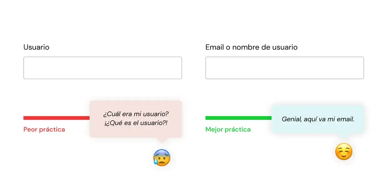
- Also work on UX Writing; write and think about the words we use taking into account the interaction and navigation.
- Pay special attention to the forms, where a large part of the signs of frustration are concentrated.

The coherence of the digital product with reality is one of the main factors to take into account
Every day, we come across cases that do not respond to this principle. We refer, for example, to the purchase processes in e-commerce. It turns out that when we are buying a product, the navigation is interrupted at the moment in which it is necessary to register or log in.
If in a physical store they do not force us to provide our contact information or that we become "partners" to buy, why in most online stores are we forced to do so? This reality leads us to numerous reflections: when did this requirement begin to be established? Was it a request from the sales team? Is it something that continued to be implemented in other e-commerce by pure inertia? Is it a requirement that In the short term it can mean losses, but in the long term it can bring certain benefits? Food for thought.
Guest checkouts have been one of the most recent solutions to this problem, but, according to the Baymard Institute, 72% of e-commerce do not highlight this option, going unnoticed in the eyes of the person who is buying. Therefore, when we want to solve or avoid a negative user experience, we must analyze signs of frustration like this and correct them as soon as possible, especially in conversion rate optimization (CRO) processes.
Here are some of the most common and helpful signs of frustration in the UX research phase:

Rage Clicks
Rage clicks happen when users repeatedly and aggressively click on a button — usually to close a pop-up or submit a form that isn’t responding properly.
If you've never experienced this before, try the rage-click game, where you will have to face all kinds of spam.

Error Clicks
Error clicks show sessions with a click just before a JavaScript error or console error occurs.

Dead Clicks
Clicks that have no effect on the page, that is, they do not imply any change in the content. They show up as clicks, but do not respond to their function.

Thrashed Cursor
This describes when users move the cursor erratically, in circles, a sign they’re confused or frustrated and can’t find what they need.

Abandoned forms
Abandoning a form or checkout process is a clear sign of friction with the digital product and often means losing a lead or potential customer.
There are abandoned cart recovery options, for example, that allow us to re-interact with the user via email encouraging them to finish the process (although they must at least have registered and shared their email). However, the most effective solution is really to detect the reason for the abandonment to correct it as soon as possible.
Tools and methodologies that help identify areas of friction. Hotjar is one of the most widely used, but there are others.
At this point, it is important to use methodologies and tools that allow us to detect signs of frustration in order to eliminate and/or minimize them. We refer to UX research or user research, such as interviews, field research, usability tests, etc.
Some methodologies that we use at Workoholics are Design Thinking, Design Sprint, Lean, Scrum…
Tools that can help you:
- Maps of heat, clicks, displacement or scroll, movement or mouse and gaze. Hotjar is one of the most widely used heatmap tools, but there are multiple options.
- Card sorting to create a good information architecture. It consists of sessions for sorting cards and categories.
- 5 second test. Show a first design or sketch for 5 seconds and then ask questions to find out that first impression.
- Systemic thinking sessions, a way of seeing the connections and interdependence of people in an environment.
- Google analytics metrics or other digital analytics tools to know the starting point and propose a CRO strategy, with an eye on the continuous improvement of the digital tool.
- Interviews.
- User flows.
- Etc.
The number of methodologies and tools exceeds those mentioned in this article, but this list is a good starting point. Now it's time to focus on these signs of frustration to minimize user friction with the digital product. Let's do it.
Steve KrugThe reality is that most of the time we don’t choose the best option, but we choose the first reasonable option that we come across.
