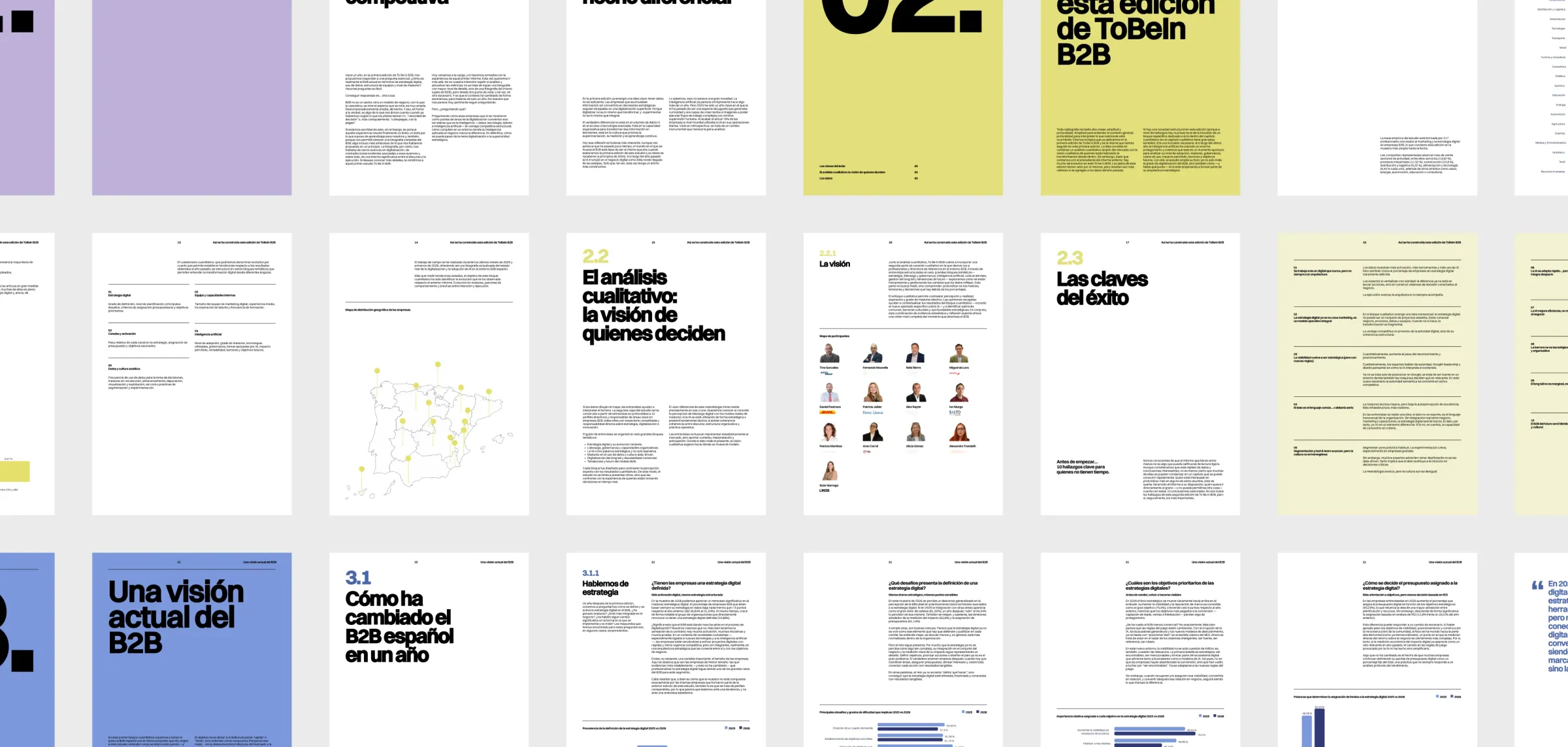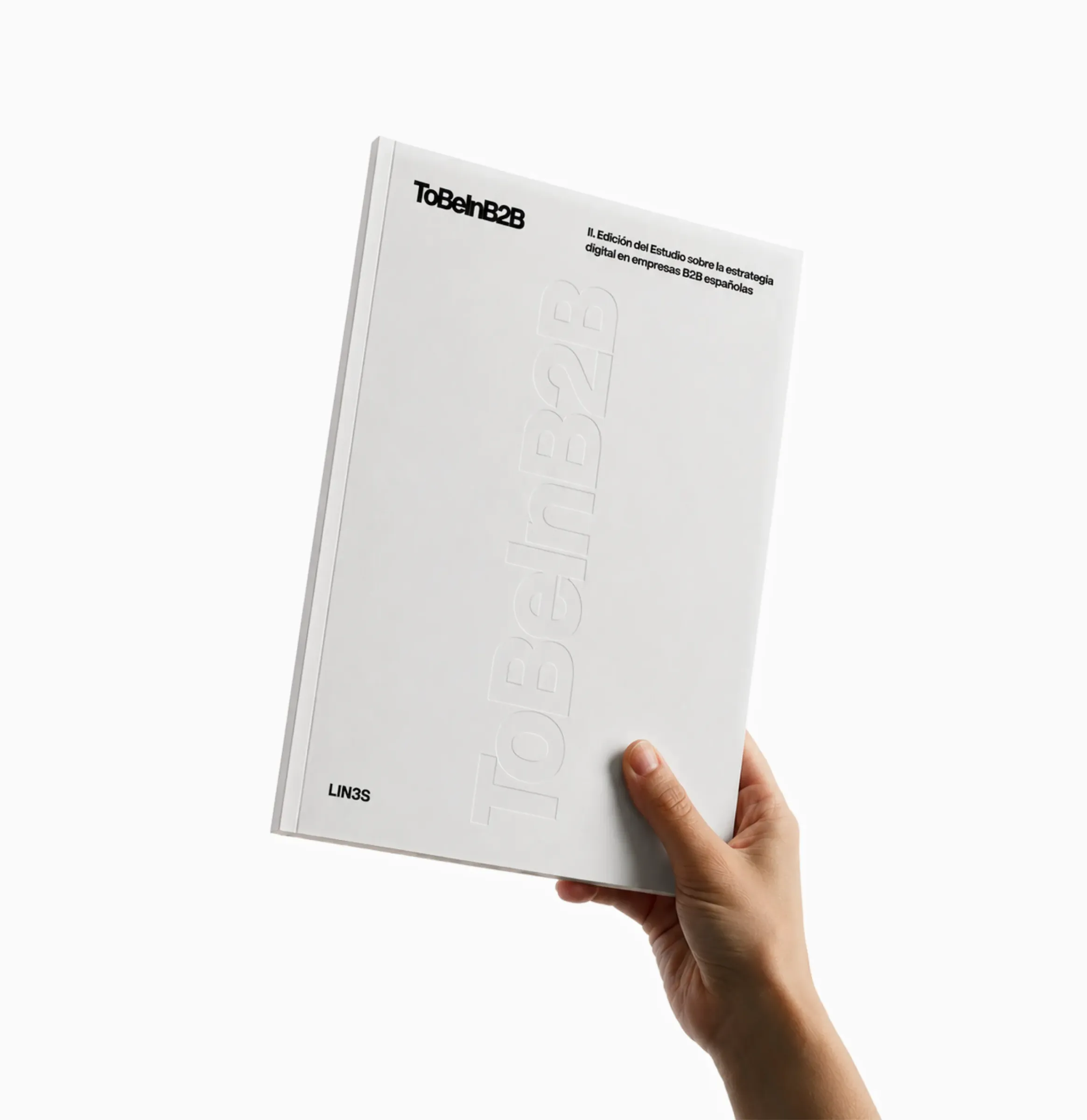

ToBeInB2B puts data behind this reality. Led by LIN3S, the study explores the evolution of digital strategy among Spanish B2B companies, addressing topics such as the adoption of artificial intelligence, data governance, strategic maturity, and the emergence of new business models and ways of engaging with the market.
For this second edition, we had the opportunity to collaborate on the design of its visual identity. The concept of an X-ray allows us to look inside B2B and reveal its layers, tensions, progress and the questions that remain unresolved.
The identity needed to go beyond the report itself and work across the digital platform, events, content, newsletters, social media and physical materials. The challenge was to build a flexible and recognisable visual language that could adapt to all these contexts without losing the core idea behind it.
An X-ray of B2B
From the outset, the X-ray concept served as the project's central thread. The study was created to explore what is happening inside B2B organisations (to understand challenges, identify trends and analyse digital strategy), and we translated this idea of ‘looking inside’ into the visual system through gradients that evoke scans, layers of information and medical imaging. The interesting part was keeping this visual device alive across such varied formats as the landing page itself, newsletters, event badges and presentations, adapting it to each medium without losing its essence.


Bold typography and colour coding
The identity needed a clear and recognisable presence. That is why the logo and typographic system are built around a bold, direct and prominent approach.
Text does not function solely as content, but as an active part of the composition. Large headlines, strong blocks and a visual hierarchy designed to give data, quotes and key messages a presence of their own.

Another challenge was creating a system capable of adapting without losing coherence.
We developed more editorial and carefully considered compositions, seeking a balance between legibility and experimentation. The website needed to organise the content and make the study easy to explore, while also conveying a distinctive identity. The same applied to newsletters, social media posts, event materials and audiovisual content.
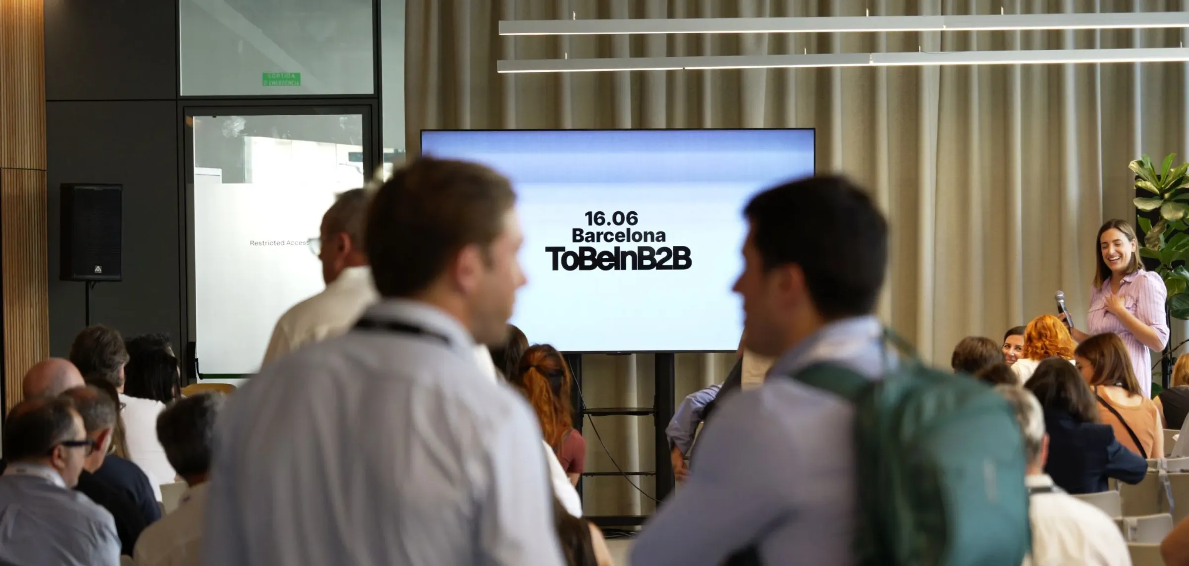
In addition, each city had its own colour within the visual system. Madrid, Bilbao, Barcelona and the online edition could be quickly identified through specific colour codes, providing flexibility without compromising brand consistency.
The key was ensuring that everything belonged to the same visual language, rather than making each piece feel like an isolated application.
From pixels to merchandise
The design needed to move from the screen into the physical world. Merchandise (notebooks, pens and bags) and the event's physical materials were conceived as natural extensions of the visual system. We did not want them to be merely decorative pieces, but useful objects that continued to reinforce the idea of analysis, exploration and looking beneath the surface.
A key initiative for the sector
ToBeInB2B is one of those projects where collaboration is visible in the final result. LIN3S brought an impeccable strategic vision for the study and the kind of conversation it wanted to generate around the sector and our role was to contribute through design, translating that complexity into a recognisable, multichannel visual language.
Beyond its visual expression, however, ToBeInB2B is an essential initiative for taking the pulse of digitalisation, understanding the challenges posed by AI and assessing commercial maturity in Spain. We invite you to dive into the data and draw your own conclusions.